Lark
BRAND IDENTITY, NAMING, PACKAGING, PHOTOGRAPHY, PHOTO STYLING, STRATEGY, WEBSITE
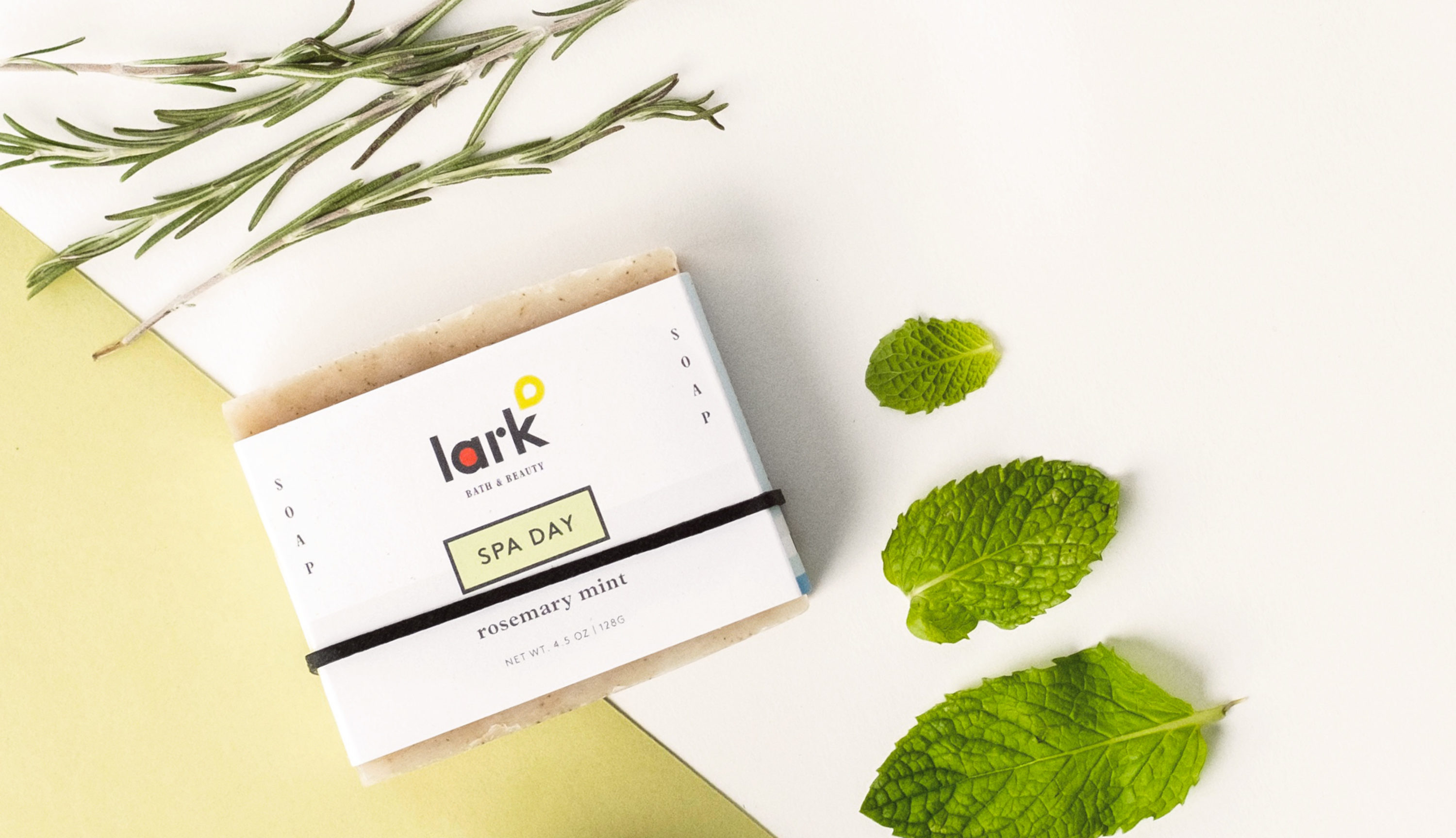
Lark Bath and Beauty wanted to do more than simply sell wholesome products to promote health and beauty, they wanted to rewrite the rules of what it means to be beautiful and free. With a portion of their proceeds going toward international partner organizations that help women find true beauty and true freedom, their identity was designed to be bold, straight-forward, and hopeful. A simple-yet-beautiful labeling system stands apart from competition their competition and is easily read and recognized on the shelf.


“Working with Shane on our rebrand was such a fun and incredible experience. We were delighted at his ability to capture the big picture and still get into the nitty gritty details of the design and photography styling to bring it all together. We also laughed our asses off along the way.”
PHOTOGRAPHY BY AARON COURY • STRATEGY BY AMY BARRUS • COPYWRITING BY STEPHANIE GILMAN
